
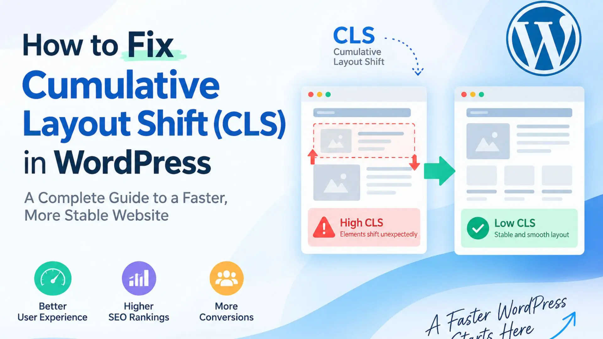
What is Cumulative Layout Shift?
CLS measures unexpected visual movement during the life of a page. It is not a loading-speed measurement. A page can load quickly and still have poor CLS if visible elements move after appearing.
A CLS score of 0.10 or lower is generally considered good. The most disruptive shifts usually happen when the browser does not know how much space to reserve before an image, iframe, font, carousel, form, advertisement, or JavaScript-powered component is ready.
The central rule: reserve the final geometry
Before a component loads, its initial box should be as close as possible to its final box. If a video will be 420 pixels wide and 236 pixels high, the surrounding layout should reserve that 16:9 area immediately. If a carousel will occupy 350 pixels on mobile, it should not begin at 36 pixels and expand later.
How we diagnosed the problem
We tested the page on desktop, tablet, and mobile devices.
First, we compared the layout before and after scrolling, clicking, lazy loading, and JavaScript initialization. This helped us find shifts that only appeared after user interaction.
We also checked element width, height, and position before and after each change.
Our practical diagnostic sequence was:
- Open the page in a fresh Incognito window with the browser cache disabled.
- Record a Performance trace in Chrome DevTools and inspect Layout Shift events.
- Reload without clicking, then repeat after the first interaction.
- Slowly scroll through lazy-loaded videos, images, forms, sliders, and the footer.
- Compare the affected element’s width, height, and top position before and after initialization.
- Repeat at the real breakpoints, especially around 767–769px and 979–981px.
- Test one change at a time so the effect of each fix remains measurable.
1. YouTube embeds changing height after load
The symptom
The embedded video initially occupied an incorrect height. After the lazy loader or YouTube script initialized, the iframe changed to its true 16:9 size and the article content moved upward. On smaller screens, the iframe could also be wider than its parent until responsive rules took effect.
Why it happens
A width of 100% alone does not reserve height. Some themes or optimization plugins temporarily replace the iframe source, and builder defaults may apply a fixed height before responsive styles are available.
The fix
Reserve the aspect ratio on both the iframe and, where possible, its immediate wrapper. Make the iframe block-level to remove baseline space and prevent fixed HTML dimensions from overriding the responsive box.
.article-video {
width: 100%;
aspect-ratio: 16 / 9;
overflow: hidden;
}
.article-video iframe {
display: block;
width: 100% !important;
height: 100% !important;
border: 0;
}
If the iframe is directly inside a paragraph, remove the paragraph’s line-height or margin only with a narrowly scoped selector. Do not globally change every paragraph that contains media.
2. Carousels expanding or collapsing after JavaScript initialization
The symptom
Before the carousel script ran, slides rendered as ordinary stacked content or as a very short row. When Slick or another carousel library initialized, the same content was reorganized and its height changed dramatically. On mobile, lazy-loaded slide images caused a second expansion when they entered the viewport.
The fix
Reserve a breakpoint-specific minimum height for the carousel’s outer row or stable wrapper. Images inside slides must also receive explicit dimensions or an aspect ratio. The reserved height should be based on measured final geometry, not an arbitrary desktop value copied to every viewport.
.review-carousel-row { min-height: 670px; }
@media (max-width: 980px) {
.review-carousel-row { min-height: 355px; }
}
.review-carousel-row img {
width: 100%;
height: auto;
aspect-ratio: 1 / 1;
object-fit: cover;
}
A minimum height is effective only when applied to an element present in the initial HTML. Applying it to a wrapper created later by JavaScript cannot stabilize first paint.
3. Sticky navigation changing the document layout
The symptom
The standard header and sticky header had different heights, margins, and logo dimensions. When the sticky state activated, the navigation row became shorter and nearby page content shifted
The fix
Keep the outer header shell’s document-flow geometry stable. Create the sticky presentation inside that reserved shell and change visual properties such as transform, opacity, or an internal background layer. Dropdowns and drawers should be positioned outside normal flow so opening them does not push the page.
.site-header-shell {
position: relative;
height: 190px;
}
.site-header-shell .sticky-layer {
position: absolute;
inset: 0;
transform: translateY(-100%);
opacity: 0;
}
.site-header-shell.is-sticky .sticky-layer {
transform: translateY(0);
opacity: 1;
}
Exact values must match the website’s real header geometry. The principle is that switching visual states should not unexpectedly add to or remove from the document flow.
4. Images loading without reserved dimensions
Thumbnail and content images caused movement because their placeholder boxes began at zero height. When the image URL was populated or the image entered the viewport, the row expanded.
Use real width and height attributes whenever the intrinsic image dimensions are known. For responsive cards with a consistent crop, reinforce the reservation with CSS:
.article-card__image {
width: 100%;
aspect-ratio: 1 / 1;
object-fit: cover;
display: block;
}
Do not add width and height attributes that describe a different ratio from the displayed image. The browser uses those values to calculate the initial aspect ratio, so inaccurate dimensions can create a shift of their own.
5. Web fonts changing text geometry
When the intended font arrived late, fallback text occupied different widths and line heights. Headings wrapped differently, navigation labels moved, and entire sections changed height.
Host production WOFF2 files locally where licensing allows, declare every weight actually used, preload only truly critical fonts, and choose a sensible font-display strategy. Remove duplicate font requests from themes, builders, and Google Fonts integrations.
@font-face{
font-family: 'Site Sans';
src: url('/wp-content/uploads/fonts/site-sans-regular.woff2') format('woff2');
font-weight: 400;
font-style: normal;
font-display: swap;
}
font-display: swap improves visibility but does not guarantee zero movement. Reducing unused weights and choosing a fallback with similar metrics can further limit reflow.
6. Forms collapsing after successful submission
Several forms were replaced by a short success message after AJAX submission. A form hundreds of pixels tall disappeared instantly, moving everything below it upward. Although some layout shifts shortly after direct user input may be excluded from field CLS, the experience still feels broken and can be captured in other testing scenarios.
The cleanest solution is often to redirect successful submissions to a dedicated thank-you page. If the form must remain on the same URL, reserve the form wrapper’s height through the transition and reduce it only through an intentional, user-friendly animation.
.contact-form-shell { min-height: 900px; }
@media (max-width: 767px) {
.contact-form-shell { min-height: 1100px; }
}
Measure the real form height at each breakpoint. A single fixed minimum height can leave excessive blank space on desktop or still be too short on mobile.
7. Delay JavaScript exposing unstable fallback layouts
Delay JavaScript can improve initial performance, but it may postpone the code that converts raw markup into a carousel, responsive grid, popup, locator, or other interactive component. If the uninitialized markup has different dimensions, the first interaction becomes a layout-shift trigger.
The safest process is to identify the exact script and component, confirm the before-and-after geometry, and then stabilize the fallback HTML/CSS. Excluding a script from delay can be appropriate when initialization is required for first-paint geometry, but broad exclusions should not be the first response. They can reduce the performance benefit and hide the underlying layout problem.
Common fixes that do not solve the root cause
- Clearing every cache without measuring which element moved.
- Adding a large min-height to the entire page instead of the unstable component.
- Using desktop height values on tablet and mobile.
- Disabling lazy loading globally when only one component needs reserved space.
- Excluding many scripts from delay without checking their purpose.
- Trusting one Page Speed Insights run without reproducing the shift locally.
- Fixing the final layout while leaving the initial, pre-JavaScript layout unstable.
How to verify a CLS fix properly
A successful fix should preserve component geometry from first paint through delayed initialization. Use this checklist after every change:
- Test in a new session with cache disabled, then repeat with the production cache enabled.
- Check desktop, tablet, and mobile, including one pixel on either side of important breakpoints.
- Compare element rectangles before and after clicking, scrolling, and lazy loading.
- Confirm there is no horizontal overflow at tablet widths.
- Test slowly enough to expose delayed assets, then repeat under normal conditions.
- Review Chrome DevTools Layout Shift entries and identify the shifted node.
- Run Lighthouse or PageSpeed Insights only after local geometry is stable.
- Check that the fix does not create blank space, crop content, or block interaction.
The broader lesson
WordPress CLS is rarely fixed by installing another optimization plugin.
Page builders, themes, lazy-loading tools, fonts, embeds, and performance plugins can all affect the page layout. Therefore, the best approach is to find the exact element that moves.
Next, compare its size before and after loading. Then reserve the correct amount of space and test the component again.
In our case, the best fixes were simple and targeted. We reserved a 16:9 area for videos, added responsive height space for carousels, kept the sticky header layout stable, added proper image dimensions, improved font loading, and controlled form behavior after submission.
Each fix focused on the element causing the movement instead of hiding the problem with a large generic height.
Need help fixing WordPress Core Web Vitals?
Ecron Inc. helps businesses diagnose and resolve WordPress performance problems across custom themes and popular builders, including Divi, Elementor, and Avada. We trace layout shifts to the responsible element, implement targeted fixes, and test them across real responsive breakpoints.
If your website jumps during loading, after scrolling, or when a slider, form, or video initializes, contact Ecron Inc. for a technical performance review.
Introduction
A WordPress page can look fully loaded and still feel unstable. For example, a heading may move down, a video may suddenly resize, or a carousel may change height. A form can also disappear after submission and pull the footer upward.
These movements contribute to Cumulative Layout Shift (CLS), which is one of Google’s Core Web Vitals.
In a recent WordPress optimization project, we found several causes of CLS. These included embedded videos, delayed carousels, sticky navigation, images without reserved space, late-loading fonts, and forms that collapsed after submission.
Therefore, fixing CLS required more than clearing the cache. We had to focus on keeping the page layout stable from the first load.
This guide explains how we found these layout shifts, what caused them, and how to fix similar issues on WordPress websites built with Divi, Elementor, Avada, or other page builders.